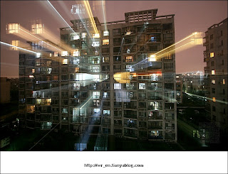
 I found this image from a bbs chatting board. It seems that this image was created by some applications, but it definitely conveys some special meanings. Lots of lines are shot out from the window, and it is likely many eyes outside are watching, or the author wanted to apply the meaning of light pollution now. I only found this image without any explanation, but I like this feeling, so I posted it here!
Friday, September 21, 2007
creative image!
 I found this image from a bbs chatting board. It seems that this image was created by some applications, but it definitely conveys some special meanings. Lots of lines are shot out from the window, and it is likely many eyes outside are watching, or the author wanted to apply the meaning of light pollution now. I only found this image without any explanation, but I like this feeling, so I posted it here!
alternating rhythm!
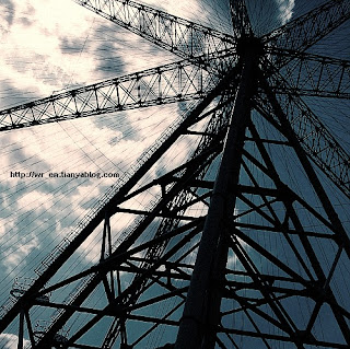 I found this picture from internet.)
I think this might be a sample of alternating rhythm. The conception of "alternating rhythm " is defined by consisting of successive patterns in which the same elements reappear in a regular order. (from a book, named <
rhythm by lines!
Thursday, September 13, 2007
asymmetrical balance!
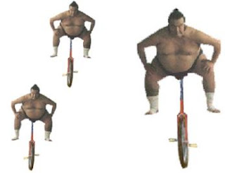
radial symmetry!
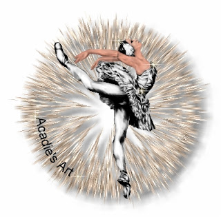
symmetrical balance
 (This image is from internet,
 Page name:Art as Co-Creation
Author:Suzanne Cheryl Gardner.)
This image is so interesting and creative. Although the shapes are not definitely mirrored by vertical axis since there is an extra bird on the right, the author applied positive place and negative place ingeniously to create a meaningful solution.
The description from author is fantastic, so I quoted it here:
Bringing balance into our lives is the key to living and bringing peace into our worlds, both the inner and outer worlds in which we live. Tom Kenyon says in his book “The Magdelan Manuscript,” “The key to a fruitful creation whether it be cosmic or individual was seen (during pagan consciouness) as a balance between these forces (spirit and matter).” The forces he speaks of are the human soul spirit connection, and nature. In Machelle Small Wright’s co-creative process books she says this partnership strikes what she calls an involution/evolution balance in our lives. A balance that we once had when we created hand in hand with nature; whereas today without this co-creation we have the human soul creating imbalance in every aspect of our world. When we can return to having respect for the forces of nature intelligence and elicit a conscious co-creation with nature is when we may have the opportunity to bring balance and peace back into our individual lives that make the way for peace in our outer world.


