 (This is Triadic color schemes example! )
Wednesday, October 24, 2007
Split Complementary color scheme sample!
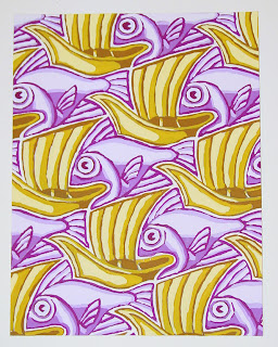 I find this image from America artist. This is an example of using split complementary color scheme. Rather than pair color that are in opposite position on the color wheel, the artist completes the scheme using the two colors on either side of one of the ecomplements. You can see this image is dominated by yellow and violet. It is unified by repetition.
monochromatic color scheme sample!
Thursday, October 18, 2007
illusion of space created by location!
atmospheric depth!
illusion of space created by overlapping!
An image from Adobe Design Center Gallery !

This image created the illusion of space by location, which is its feature that attracted me. Visual elements placed on the topper of the page tend to recede, while the hills placed at the bottom tend to advance. The large mansion at the top of the picture appears more distant, despite their large size. The only red color item contrasted with other grey color background, and was emphasized in the whole design.
Thursday, October 11, 2007
masked images from Adobe Stock Photos!
 $129-$399
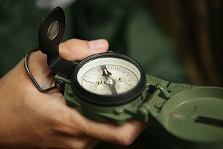 $99-$474
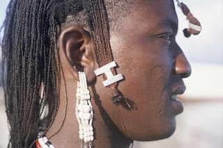 $144.99-$449.99
These three images were downloaded from Adobe Bridge, the prices have been listed below the picture. The reason why I gave a price range is that they are depended on the size of images.
I don't know why just a single picture costs too much, maybe they have some special usage, but I haven't realized them now.
illustration from Adobe Stock Photos
 $54.99-$174.99
 $54.99-$174.99
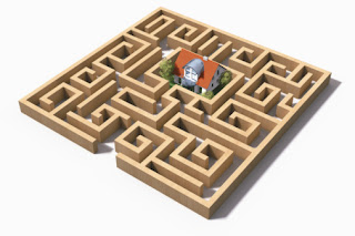
$144.99-449.99.
These three images were downloaded from Adobe Bridge, the prices have been listed below the picture. The reason why I gave a price range is that they are depended on the size of images.
These three images are really nice, especially the second one, I think it is so creative that it may be cost much more, but the fact is not in that way. If you compare the second one and third one, you will find the third one is simple ( just a maze), but it cost more than second one. So I'm a little confused about the standard of the price .
photos from from Adobe Stock Photos
$109-$429
$49-$429
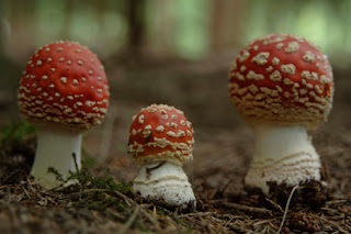 This image costs $144.00-$444.99
These three photos were downloaded from Adobe Bridge, the prices have been listed below the picture. The reason why I gave a price range is that they are depended on the size of images.
They are all really very nice picture, but they are so expensive. Maybe they are have some specific usage. I have remembered when I was a child, my friend told me photography learning is very expensive.......I think I find the reason here.
Thursday, October 4, 2007
A source that I have not touched before!
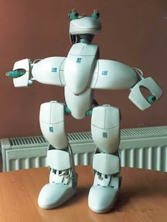
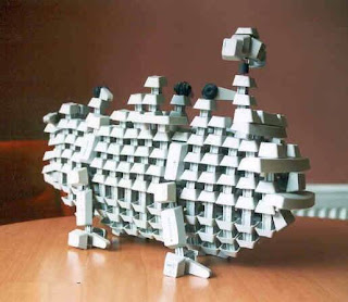
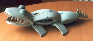
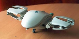 I found these images from a bbs chatting board. I think they are amazing and creative. The designer used some pieces of broken mouse, and added creative ideas then they are become vivid models. I have remembered that when I was a child, I used some pepsi cans to make tools, dolls, but I haven't touched these kinds of models, especially apply some recycle stuffs!
Monday, October 1, 2007
Parkland art gallery!
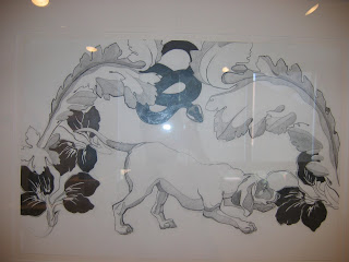
I've attached a picture of drawing, author is WATT, ATTHEW D.
From this picture, you can see the symmetrical balance. The little smaller leaf on the left adds the snake can balance the large leaf on the right.The white leafs contrast with black leafs. One dog in the middle laps up the leaf at the right bottom, and the tail touches the little up leaf on the left. The whole picture uses just black ,gray and white color, but the value contrast can see the different lay of the image. The repeat curve lines create the rhythm in the picture.
Subscribe to:
Comments (Atom)


