Monday, December 10, 2007
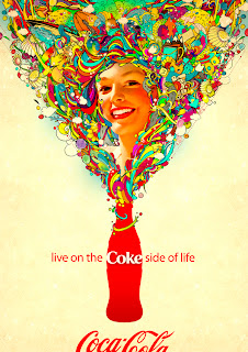
A good advertisement

Communication arts
Atmospheric depth
metaphorical thinking example.
Monochromatic harmony example
Angle of meat.
book cover redesign
Tuesday, December 4, 2007
Book cover example 3
Good book cover 2
book cover1!
Wednesday, November 14, 2007
A image from parkland art gallery
Friday, November 2, 2007
Online Tutorials try!
This time, I picked up one part of photo shop tutorials about brush. This tutorial told us how to use brush to create magic image.
Do you believe that when I watch some complex images like this tutorials samples before, I usually marvel at them " oh, my god , the artists are so professional that they could create some complicated images in this way."
However, after I learnt from this tutorial, I knew the secret code. This is a link to the tutorial that I did: http://designfruit.com/jasongaylor/blog/?p=37
Thank to this tutorials since it explains the question that was in my heart for a long time.
From this link: http://tutorialblog.org/free-photoshop-brushes/
you can see some other external style brushes available there. Through them , you also can create some magic images.
Wednesday, October 24, 2007
Color schemes compared!
Split Complementary color scheme sample!
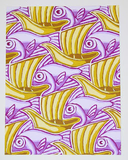 I find this image from America artist. This is an example of using split complementary color scheme. Rather than pair color that are in opposite position on the color wheel, the artist completes the scheme using the two colors on either side of one of the ecomplements. You can see this image is dominated by yellow and violet. It is unified by repetition.
monochromatic color scheme sample!
Thursday, October 18, 2007
illusion of space created by location!
atmospheric depth!
illusion of space created by overlapping!
An image from Adobe Design Center Gallery !

Thursday, October 11, 2007
masked images from Adobe Stock Photos!
 $129-$399
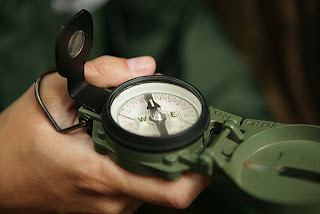 $99-$474
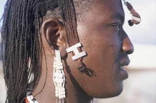 $144.99-$449.99
These three images were downloaded from Adobe Bridge, the prices have been listed below the picture. The reason why I gave a price range is that they are depended on the size of images.
I don't know why just a single picture costs too much, maybe they have some special usage, but I haven't realized them now.
illustration from Adobe Stock Photos
 $54.99-$174.99
 $54.99-$174.99
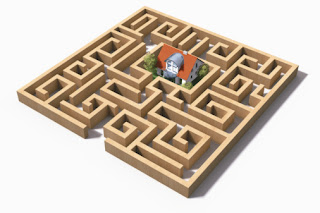
$144.99-449.99.
These three images were downloaded from Adobe Bridge, the prices have been listed below the picture. The reason why I gave a price range is that they are depended on the size of images.
These three images are really nice, especially the second one, I think it is so creative that it may be cost much more, but the fact is not in that way. If you compare the second one and third one, you will find the third one is simple ( just a maze), but it cost more than second one. So I'm a little confused about the standard of the price .
photos from from Adobe Stock Photos

$109-$429
$49-$429
 This image costs $144.00-$444.99
These three photos were downloaded from Adobe Bridge, the prices have been listed below the picture. The reason why I gave a price range is that they are depended on the size of images.
They are all really very nice picture, but they are so expensive. Maybe they are have some specific usage. I have remembered when I was a child, my friend told me photography learning is very expensive.......I think I find the reason here.
Thursday, October 4, 2007
A source that I have not touched before!
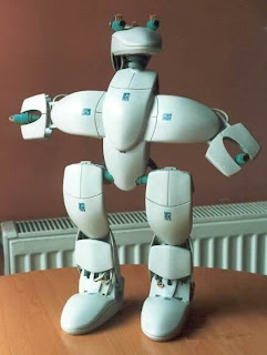
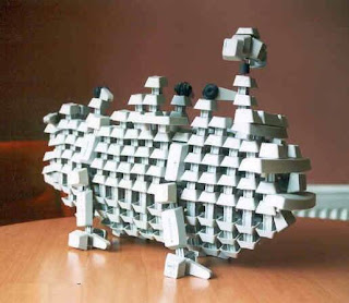
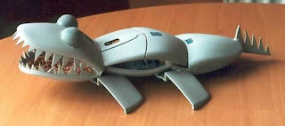
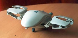 I found these images from a bbs chatting board. I think they are amazing and creative. The designer used some pieces of broken mouse, and added creative ideas then they are become vivid models. I have remembered that when I was a child, I used some pepsi cans to make tools, dolls, but I haven't touched these kinds of models, especially apply some recycle stuffs!
Monday, October 1, 2007
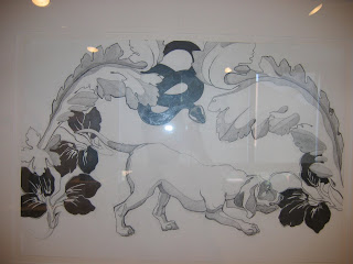
Parkland art gallery!
Friday, September 21, 2007
creative image!
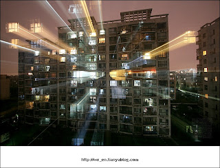 I found this image from a bbs chatting board. It seems that this image was created by some applications, but it definitely conveys some special meanings. Lots of lines are shot out from the window, and it is likely many eyes outside are watching, or the author wanted to apply the meaning of light pollution now. I only found this image without any explanation, but I like this feeling, so I posted it here!
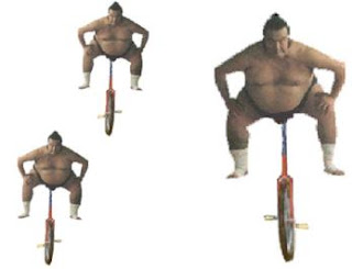
alternating rhythm!
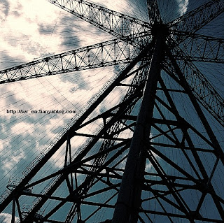 I found this picture from internet.)
I think this might be a sample of alternating rhythm. The conception of "alternating rhythm " is defined by consisting of successive patterns in which the same elements reappear in a regular order. (from a book, named <
rhythm by lines!
Thursday, September 13, 2007
asymmetrical balance!
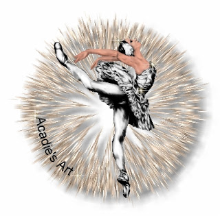
radial symmetry!
symmetrical balance
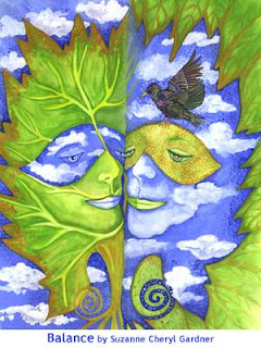 (This image is from internet,
 Page name:Art as Co-Creation
Author:Suzanne Cheryl Gardner.)
This image is so interesting and creative. Although the shapes are not definitely mirrored by vertical axis since there is an extra bird on the right, the author applied positive place and negative place ingeniously to create a meaningful solution.
The description from author is fantastic, so I quoted it here:
Bringing balance into our lives is the key to living and bringing peace into our worlds, both the inner and outer worlds in which we live. Tom Kenyon says in his book “The Magdelan Manuscript,” “The key to a fruitful creation whether it be cosmic or individual was seen (during pagan consciouness) as a balance between these forces (spirit and matter).” The forces he speaks of are the human soul spirit connection, and nature. In Machelle Small Wright’s co-creative process books she says this partnership strikes what she calls an involution/evolution balance in our lives. A balance that we once had when we created hand in hand with nature; whereas today without this co-creation we have the human soul creating imbalance in every aspect of our world. When we can return to having respect for the forces of nature intelligence and elicit a conscious co-creation with nature is when we may have the opportunity to bring balance and peace back into our individual lives that make the way for peace in our outer world.


